Schutz

THAT #LIGHTSMEON

Copy and culture-first concept for the Valentine's Day campaign teaser

For Schutz's Valentine's Day campaigns, the usual romantic language just doesn't work. Hearts, lovey-dovey copy, Cupid, bows and arrows… none of it reflects how the Schutz woman loves. She's a woman with fire, urgency and desire. She knows how to pursue and be pursued. She loves with an appetite for love.


The 2024 collection featured shoes and bags with matchstick details, plenty of vinyl and attitude. So we took the overarching campaign concept, Light Me On, and developed an expression that reflected how our audience's archetype loves:

That #LightsMeOn.


Playing on the expression ‘turns me on’, the teaser assets showed familiar scenes from the Schutz woman's world and revealed what #LightsHerOn. This conveyed the personality we wanted for the campaign and echoed details of the products before revealing them, creating a sense of anticipation and setting the tone for our communication. And the shoes were the most beautiful in the WORLD!!


For this project, I developed the creative concept, copy and manifesto.

Art direction by the incredibly talented Mayara Colucci.

O Boticário

LIFE IS STRAWBERRIES & MILK

Script for the world's first K-drama-format commercial

O Boticário was all set to bring back Cuide-se Bem Morango & Leite (Strawberry & Milk), a body-care PHENOMENON discontinued a few years earlier. Its return to shelves was driven by thousands of nostalgic fans who showed up on Boti's social channels every week asking for their beloved creamy strawberry scent to come back.

But beyond listening to our community's requests, we were looking closely at interests beneath the commercial surface: okay, you want our products. But what else do you consume, listen to, watch, eat, feel, share, want and love?

By connecting shopping interests with cultural interests, we noticed that, just as Morango & Leite was about to return, the world of Cuide-se Bem lovers was colliding with another universe:

K-dramas.

Korean dramas were growing exponentially in popularity, fuelling the community's appetite for everything in their stories: from dreams of sweet, light-hearted romance to cravings for the food and drinks on screen. And that was when we found a coincidence too good to ignore: one of the Korean drinks most often featured in K-dramas was made with… strawberries and milk. Come on, right?!

With that insight, we turned Cuide-se Bem Morango & Leite's comeback into a K-drama-worthy story to binge on a rainy Sunday.

That's how ‘A Vida é um Morango e Leite’ (Life Is Strawberries & Milk) was born: the world's first campaign film in a K-drama format. Click the GIF above to watch it. But if you're into spoilers, here's a taste: mystery, romance, twists, reunions, action and everything a proper K-drama needs, all set inside Grupo Boticário's factory. For this project, I co-created and developed the script, from narrative structure to dialogue, drawing on K-dramas' verbal and visual language to turn a product relaunch into entertainment. I wrote it with the talented copywriter Beatriz Stradiotto.

The result? A campaign that connected product, behaviour and culture, selling out 20 days' worth of stock in just one week. I had SO much fun creating this case. And the products smell amazing 🫰🏻🍓

AWARDS


ART DIRECTION

Thais Dyck and João Lessa


TikTok Ad Awards 2025

Gold — Best Creative Campaign for Business Impact


TikTok Ad Awards 2025

Bronze — Best Use of a Trend


CREATED AT

Agência SoWhat

Eudora

WHAT A GLAM!

Naming and creative strategy for Eudora's beauty, content and activation platform

Formula 1 has never been bigger. Its female fan community is growing and becoming more established: women account for 42% of the sport's total audience. Within the web of words, behaviours and conversations around this world, we spotted a pattern during games, championships and races: the spotlight, usually on the athletes, was inevitably shifting towards the women in their orbit.

People can't help discussing the makeup, outfits, advocacy, hair, perspectives and worldviews of the women alongside these athletes, the so-called WAGs: ‘Wives and Girlfriends’.

But there's a problem, see? These magnetic, interesting, ever-present women spent years being reduced to that acronym. Wives and girlfriends. They were even dismissed as gold diggers, boxed into a deeply misogynistic framework, if you ask me.

If they now spark as much conversation as the men, or more, as whole women beyond those labels, why keep defining their relevance through the men beside them?

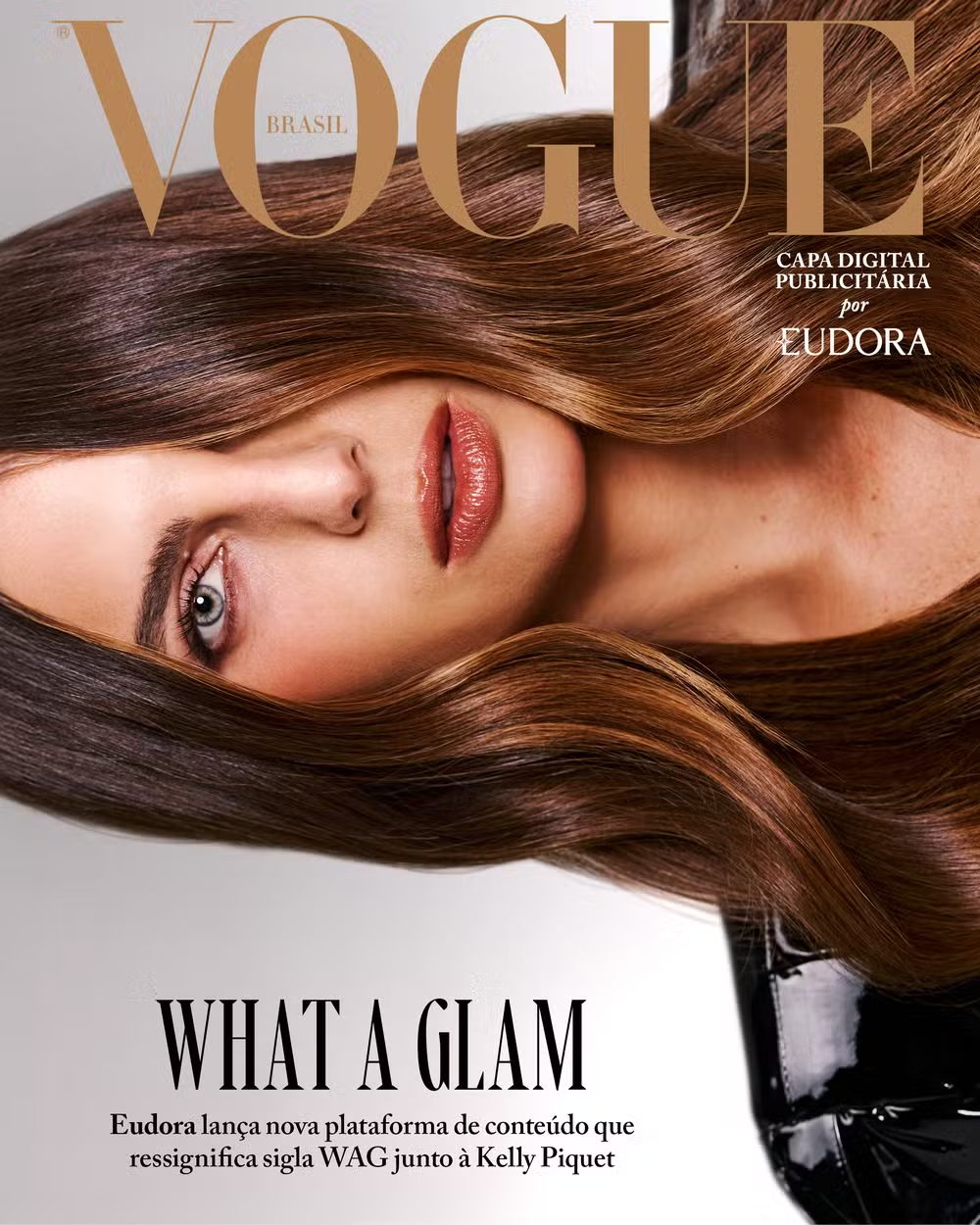
So we created WHAT A GLAM!, a platform by Eudora, whose rallying cry is ‘Go out there and shine!’. A movement designed to give the acronym a new meaning and formally put these women centre stage, where they already belong. Inevitably.

Kelly Piquet was the first to take part, in a Vogue interview you can read by clicking alongside. Since then, other women from the world of sport have had the chance to show who they are, what they like, think and aspire to, regardless of who walks beside them.


For this project, I developed the platform's entire creative strategy alongside the wonderful PR professional Luiza Queluz. I also created its name and developed briefs and script direction for content shoots and supporting materials.

‍

O Boticário

CHERRY PHASES

Creative strategy, PR stunt and scripts

Cleanse, exfoliate, moisturise, protect. Morning, evening, winter and summer routines.


TikTok has become the world's biggest school of self-care rituals: just open your For You feed to discover a new Korean skincare routine or a pre-makeup checklist with steps you never knew existed. And we learn every one by heart.


The beauty industry understood and followed this behaviour, creating increasingly personalised solutions: products for dry or acne-prone skin, curly or coloured hair, tattooed skin, and so on. Yet the very same industry was overlooking one of the biggest influences on women's bodies: the phases of the menstrual cycle.


Mood, energy and skin change every week. Even so, the body-care category offered a single solution for the whole month, ignoring all the physiological changes that occur as the menstrual cycle progresses. The need existed. The category didn't.


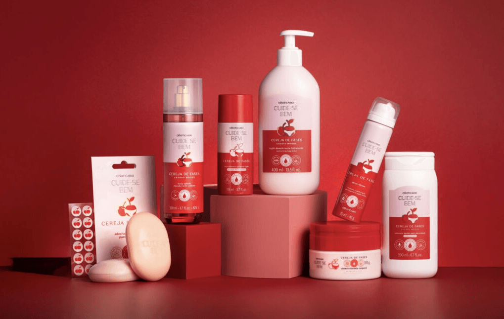
To fill that gap, O Boticário created Cuide-se Bem Cereja de Fases (Cherry Phases): the first body-care range developed to follow the menstrual cycle. But how do you launch a category nobody knew they needed?


Although millions of women learn about self-care on social media every day, menstrual care never featured in those routines. Today's generation no longer sees menstruation as taboo, yet rarely talks about it. While people who menstruate knew every step of their morning skincare routine, few could name the cycle's phases in order or explain what happens in their bodies during each one.


That's where Geração Cereja (the Cherry Generation) came from. A movement we created to finally add the missing step to every TikTok self-care routine: caring for your body according to each phase of the menstrual cycle.


CREATED AT

Agência SoWhat

AWARDS

Effie Awards 2026


MMA Smarties 2026 Finalist


It began with a provocative statement from someone known for saying and doing exactly what she wants: Mel Maia declared that her generation was better than every other. But this had little to do with age. She meant the Cherry Generation: women of different generations who understand that, if the body changes throughout the menstrual cycle, self-care needs to change too.

To take the idea nationwide, we made history by making O Boticário the world's first beauty brand to use TikTok's Brand Takeover, turning the app's logo into an invasion of cherries and securing 100% audience exclusivity for one day.

To spread the message, we subverted TikTok Pulse, an ad format that places sponsored videos immediately after the top-performing organic videos in a category. Instead of appearing after menstruation and health content, we reached consumers right after the biggest beauty-routine videos.


The message was clear: if your body changes with every phase, why does your self-care routine stay the same every day?

The campaign delivered record engagement and awareness of the menstrual cycle's phases. The business impact was huge too: Cuide-se Bem rose into the category's top five on the Power metric, with a conversion return ten times the campaign investment.


For this project, I was responsible for creative strategy, the PR stunt idea, campaign naming and video scripts, working with the PR, Social and Media teams.

The Devil Wears Prada collaboration

THAT'S ALL.

Concepts, creative strategy and manifesto

A beauty brand was about to launch a product collaboration with The Devil Wears Prada 2. The launch of the century for every woman who, like me, built a career in advertising dreaming of becoming Andy Sachs. The bar was high: culture, references, relatability and nostalgia turned all the way up. A campaign of this calibre had to be done properly, so the brand called a pitch.


My creative partner, art director Mayara Colucci, and I, two obsessed and obsessive fans, threw ourselves into the challenge. Maybe we got a little too emotionally invested: since ‘a million girls would kill for this job’, we wanted to experience it first-hand.


Just as Andy made sure Miranda's daughters got their hands on the unpublished Harry Potter manuscript, we made sure that, on presentation day, the brand's clients received our slides printed as a physical magazine, complete with Post-its and handwritten notes.


It was one of the freshest, sharpest and most fun projects of my life.

Oh, and we won the pitch :)


Since the work that went live wasn't exactly the same as the copy on these pages, I've kept the brand anonymous. You can still see how I developed the manifesto and concept alongside.


Hope

HOPE #TODODIA

Strategy, creative direction, copy and manifesto

Hope was about to take a big step as a group: bring all its brands, Hope Resort, Hope Underwear and Hope Sport, together under one name: Hope. :)


It sounds simple, but the challenge was substantial: three separate online stores, three social profiles and three distinct communication styles had to converge. And it had to happen in a culturally relevant way, showing customers that the change would bring benefits and make shopping easier.


Beyond the transactional side, one thing was obvious: in consumers' minds, Hope was already one brand. It was already there throughout the day: a quick treadmill run in the building's gym during a meeting, Friday-night dates with cocktails and red lipstick, afternoons by the pool with friends, hot yoga, everything. Hope fit every moment, and Hope was for every day, naturally.


That concept, created by the brand, grew stronger through the story we chose to tell. From there, alongside the brilliant PR professional Silvia Itimura, I led the strategy for bringing multiple brands into a masterbrand. I was responsible for the 360° strategy covering content pillars, tone of voice, strategic copy and brand initiatives to be implemented throughout 2026 and 2027.


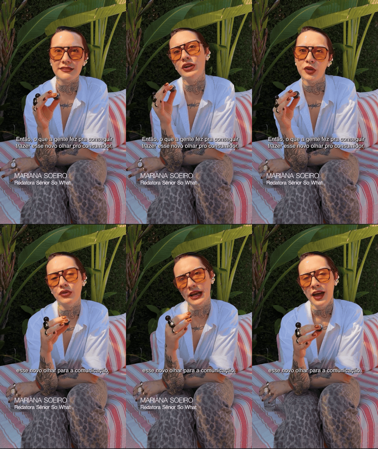
I also developed the creative moodboard and attended the shoot with Silvia Braz, the ambassador for this new chapter, making sure every image reflected the personality and fresh flavour we wanted to bring to Hope.


SOCIAL

Caroline Coelho


PR

Silvia Itimura and Marina Quintana

CREATED AT

Agência SoWhat


O Bar do Meio

BRANDING

Verbal identity, conceptual strategy and copy

I MADE A BAR!!

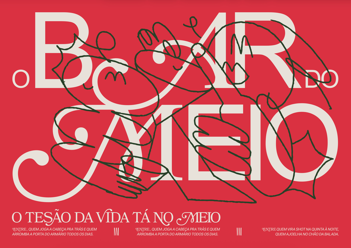
With art direction by the extraordinary Matheus Franceschi and illustrations by Yorka, we created the launch strategy, branding, posters, signs, every word and everything that fills O Bar do Meio, a bar created by Grupo Cross here in Curitiba.


Meio's building sits between two other bars, both of which also offer access to it. For the verbal and conceptual identity, I wanted to play with this physical in-between space and connect it to ideas of impermanence and transition.

‍

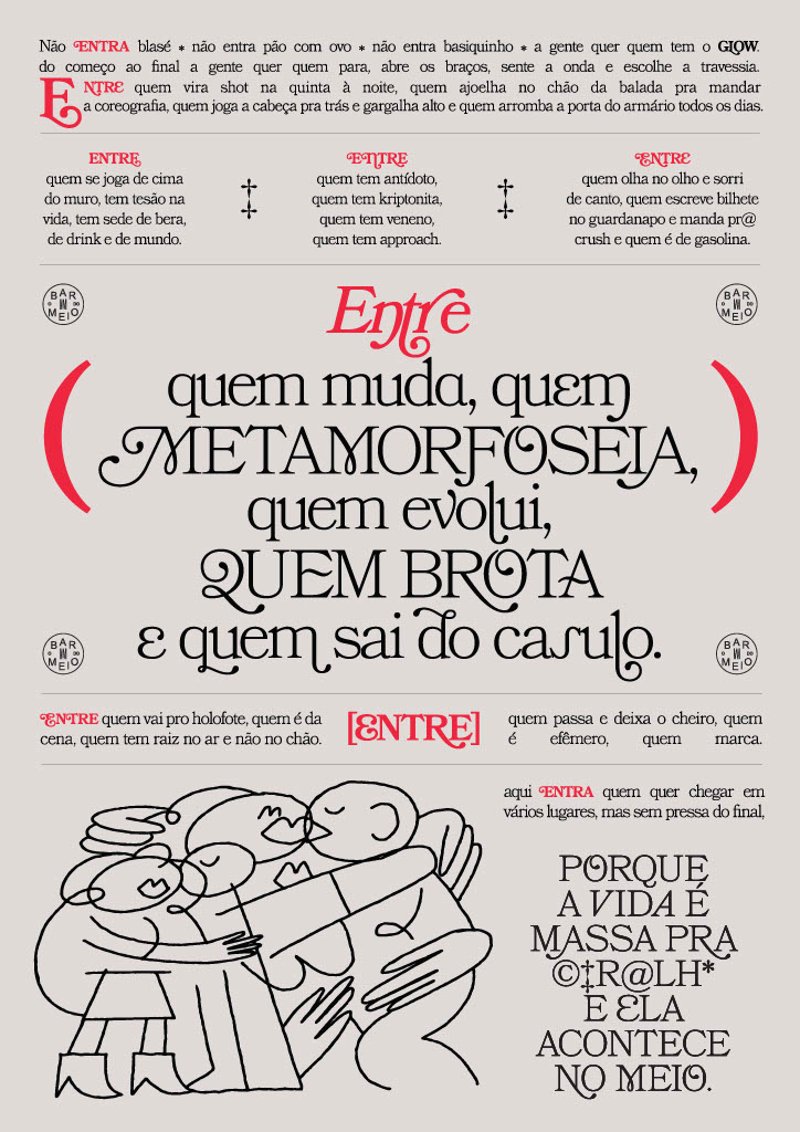
I went all in on metaphors built around ‘between’ and squeezed every last drop out of the bon vivant philosophy: enjoy the journey instead of blindly longing for the destination. The atmosphere is captured in the manifesto's closing line: ‘This is a place for those who want to go many places, without rushing to the end, because life is f@#king great, and it happens in the Meio.’ (Meio means ‘middle’.)


ART DIRECTION

Matheus Franceschi, Yorka


CREATED AT

Agência SoWhat

mariana soeiro

Schutz

THAT #LIGHTSMEON

Copy and culture-first concept for the Valentine's Day campaign teaser

Schutz — THAT #LIGHTSMEON

For Schutz's Valentine's Day campaigns, the usual romantic language just doesn't work. Hearts, lovey-dovey copy, Cupid, bows and arrows… none of it reflects how the Schutz woman loves. She's a woman with fire, urgency and desire. She knows how to pursue and be pursued. She loves with an appetite for love.

The 2024 collection featured shoes and bags with matchstick details, plenty of vinyl and attitude. So we took the overarching campaign concept, Light Me On, and developed an expression that reflected how our audience's archetype loves:

That #LightsMeOn.

Playing on the expression ‘turns me on’, the teaser assets showed familiar scenes from the Schutz woman's world and revealed what #LightsHerOn. This conveyed the personality we wanted for the campaign and echoed details of the products before revealing them, creating a sense of anticipation and setting the tone for our communication. And the shoes were the most beautiful in the WORLD!!

For this project, I developed the creative concept, copy and manifesto.

Art direction by the incredibly talented Mayara Colucci.

O Boticário

LIFE IS STRAWBERRIES & MILK

Script for the world's first K-drama-format commercial

O Boticário — LIFE IS STRAWBERRIES & MILK

O Boticário was all set to bring back Cuide-se Bem Morango & Leite (Strawberry & Milk), a body-care PHENOMENON discontinued a few years earlier. Its return to shelves was driven by thousands of nostalgic fans who showed up on Boti's social channels every week asking for their beloved creamy strawberry scent to come back.

But beyond listening to our community's requests, we were looking closely at interests beneath the commercial surface: okay, you want our products. But what else do you consume, listen to, watch, eat, feel, share, want and love?

By connecting shopping interests with cultural interests, we noticed that, just as Morango & Leite was about to return, the world of Cuide-se Bem lovers was colliding with another universe:

K-dramas.

Korean dramas were growing exponentially in popularity, fuelling the community's appetite for everything in their stories: from dreams of sweet, light-hearted romance to cravings for the food and drinks on screen. And that was when we found a coincidence too good to ignore: one of the Korean drinks most often featured in K-dramas was made with… strawberries and milk. Come on, right?!

With that insight, we turned Cuide-se Bem Morango & Leite's comeback into a K-drama-worthy story to binge on a rainy Sunday.

That's how ‘A Vida é um Morango e Leite’ (Life Is Strawberries & Milk) was born: the world's first campaign film in a K-drama format. Click the GIF above to watch it. But if you're into spoilers, here's a taste: mystery, romance, twists, reunions, action and everything a proper K-drama needs, all set inside Grupo Boticário's factory. For this project, I co-created and developed the script, from narrative structure to dialogue, drawing on K-dramas' verbal and visual language to turn a product relaunch into entertainment. I wrote it with the talented copywriter Beatriz Stradiotto.

The result? A campaign that connected product, behaviour and culture, selling out 20 days' worth of stock in just one week. I had SO much fun creating this case. And the products smell amazing 🫰🏻🍓

AWARDS

TikTok Ad Awards 2025

Gold — Best Creative Campaign for Business Impact

TikTok Ad Awards 2025

Bronze — Best Use of a Trend

ART DIRECTION

Thais Dyck and João Lessa

CREATED AT

Agência SoWhat

Eudora

WHAT A GLAM!

Naming and creative strategy for Eudora's beauty, content and activation platform

Eudora — WHAT A GLAM!

Formula 1 has never been bigger. Its female fan community is growing and becoming more established: women account for 42% of the sport's total audience. Within the web of words, behaviours and conversations around this world, we spotted a pattern during games, championships and races: the spotlight, usually on the athletes, was inevitably shifting towards the women in their orbit.

People can't help discussing the makeup, outfits, advocacy, hair, perspectives and worldviews of the women alongside these athletes, the so-called WAGs: ‘Wives and Girlfriends’.

But there's a problem, see? These magnetic, interesting, ever-present women spent years being reduced to that acronym. Wives and girlfriends. They were even dismissed as gold diggers, boxed into a deeply misogynistic framework, if you ask me.

If they now spark as much conversation as the men, or more, as whole women beyond those labels, why keep defining their relevance through the men beside them?

So we created WHAT A GLAM!, a platform by Eudora, whose rallying cry is ‘Go out there and shine!’. A movement designed to give the acronym a new meaning and formally put these women centre stage, where they already belong. Inevitably.

Kelly Piquet was the first to take part, in a Vogue interview you can read by clicking alongside. Since then, other women from the world of sport have had the chance to show who they are, what they like, think and aspire to, regardless of who walks beside them.

For this project, I developed the platform's entire creative strategy alongside the wonderful PR professional Luiza Queluz. I also created its name and developed briefs and script direction for content shoots and supporting materials.
FFW — manchete
Vogue — manchete
Steal The Look — manchete

O Boticário

CHERRY PHASES

Creative strategy, PR stunt and scripts

Cleanse, exfoliate, moisturise, protect. Morning, evening, winter and summer routines.

TikTok has become the world's biggest school of self-care rituals: just open your For You feed to discover a new Korean skincare routine or a pre-makeup checklist with steps you never knew existed. And we learn every one by heart.

The beauty industry understood and followed this behaviour, creating increasingly personalised solutions: products for dry or acne-prone skin, curly or coloured hair, tattooed skin, and so on. Yet the very same industry was overlooking one of the biggest influences on women's bodies: the phases of the menstrual cycle.

Mood, energy and skin change every week. Even so, the body-care category offered a single solution for the whole month, ignoring all the physiological changes that occur as the menstrual cycle progresses. The need existed. The category didn't.

To fill that gap, O Boticário created Cuide-se Bem Cereja de Fases (Cherry Phases): the first body-care range developed to follow the menstrual cycle. But how do you launch a category nobody knew they needed?

Although millions of women learn about self-care on social media every day, menstrual care never featured in those routines. Today's generation no longer sees menstruation as taboo, yet rarely talks about it. While people who menstruate knew every step of their morning skincare routine, few could name the cycle's phases in order or explain what happens in their bodies during each one.

That's where Geração Cereja (the Cherry Generation) came from. A movement we created to finally add the missing step to every TikTok self-care routine: caring for your body according to each phase of the menstrual cycle.

AWARDS

Effie Awards 2026

MMA Smarties 2026 Finalist

It began with a provocative statement from someone known for saying and doing exactly what she wants: Mel Maia declared that her generation was better than every other. But this had little to do with age. She meant the Cherry Generation: women of different generations who understand that, if the body changes throughout the menstrual cycle, self-care needs to change too.

To take the idea nationwide, we made history by making O Boticário the world's first beauty brand to use TikTok's Brand Takeover, turning the app's logo into an invasion of cherries and securing 100% audience exclusivity for one day.

To spread the message, we subverted TikTok Pulse, an ad format that places sponsored videos immediately after the top-performing organic videos in a category. Instead of appearing after menstruation and health content, we reached consumers right after the biggest beauty-routine videos.

The message was clear: if your body changes with every phase, why does your self-care routine stay the same every day?

The campaign delivered record engagement and awareness of the menstrual cycle's phases. The business impact was huge too: Cuide-se Bem rose into the category's top five on the Power metric, with a conversion return ten times the campaign investment.

For this project, I was responsible for creative strategy, the PR stunt idea, campaign naming and video scripts, working with the PR, Social and Media teams.
CREATED AT

Agência SoWhat

The Devil Wears Prada collaboration

THAT'S ALL.

Concepts, creative strategy and manifesto

The Devil Wears Prada collaboration — THAT'S ALL.

A beauty brand was about to launch a product collaboration with The Devil Wears Prada 2. The launch of the century for every woman who, like me, built a career in advertising dreaming of becoming Andy Sachs. The bar was high: culture, references, relatability and nostalgia turned all the way up. A campaign of this calibre had to be done properly, so the brand called a pitch.

My creative partner, art director Mayara Colucci, and I, two obsessed and obsessive fans, threw ourselves into the challenge. Maybe we got a little too emotionally invested: since ‘a million girls would kill for this job’, we wanted to experience it first-hand.

Just as Andy made sure Miranda's daughters got their hands on the unpublished Harry Potter manuscript, we made sure that, on presentation day, the brand's clients received our slides printed as a physical magazine, complete with Post-its and handwritten notes.

It was one of the freshest, sharpest and most fun projects of my life.

Oh, and we won the pitch :)

Since the work that went live wasn't exactly the same as the copy on these pages, I've kept the brand anonymous. You can still see how I developed the manifesto and concept alongside.

Hope
HOPE #TODODIA

Strategy, creative direction, copy and manifesto

Hope — HOPE #TODODIA

Hope was about to take a big step as a group: bring all its brands, Hope Resort, Hope Underwear and Hope Sport, together under one name: Hope. :)

It sounds simple, but the challenge was substantial: three separate online stores, three social profiles and three distinct communication styles had to converge. And it had to happen in a culturally relevant way, showing customers that the change would bring benefits and make shopping easier.

Beyond the transactional side, one thing was obvious: in consumers' minds, Hope was already one brand. It was already there throughout the day: a quick treadmill run in the building's gym during a meeting, Friday-night dates with cocktails and red lipstick, afternoons by the pool with friends, hot yoga, everything. Hope fit every moment, and Hope was for every day, naturally.

That concept, created by the brand, grew stronger through the story we chose to tell. From there, alongside the brilliant PR professional Silvia Itimura, I led the strategy for bringing multiple brands into a masterbrand. I was responsible for the 360° strategy covering content pillars, tone of voice, strategic copy and brand initiatives to be implemented throughout 2026 and 2027.

I also developed the creative moodboard and attended the shoot with Silvia Braz, the ambassador for this new chapter, making sure every image reflected the personality and fresh flavour we wanted to bring to Hope.

SOCIAL

Caroline Coelho

PR

Silvia Itimura and Marina Quintana

CREATED AT

Agência SoWhat

O Bar do Meio
BRANDING

Verbal identity, conceptual strategy and copy

O Bar do Meio — BRANDING

I MADE A BAR!!

With art direction by the extraordinary Matheus Franceschi and illustrations by Yorka, we created the launch strategy, branding, posters, signs, every word and everything that fills O Bar do Meio, a bar created by Grupo Cross here in Curitiba.

Meio's building sits between two other bars, both of which also offer access to it. For the verbal and conceptual identity, I wanted to play with this physical in-between space and connect it to ideas of impermanence and transition.

I went all in on metaphors built around ‘between’ and squeezed every last drop out of the bon vivant philosophy: enjoy the journey instead of blindly longing for the destination. The atmosphere is captured in the manifesto's closing line: ‘This is a place for those who want to go many places, without rushing to the end, because life is f@#king great, and it happens in the Meio.’ (Meio means ‘middle’.)
ART DIRECTION

Matheus Franceschi, Yorka

CREATED AT

Agência SoWhat